New Blog?
So, I’m restructuring a lot of things in life right now. Why don’t we take care of the website too?
I’ve been trying to find a good balance between maintainability, customization, and weight. Usually the mainstream options don’t hold up to those principles very well, but Jekyll actually manages it. It’s nice to be able to write everything in markdown, and the default templates are pretty simple and lightweight. Right now the only JS dependency is jQuery, we’ll see if it stays that way. EDIT 2/11/23: Removed jQuery. ;) Will probably at least add a lightbox plugin for images, eventually.
My site was previously written using Hexo, and while it got close to what I wanted, it was one of those things that was just non-mainstream enough that I could never get back into the flow of setting up a dev environment so that I could actually get to the writing. Lets hope this time goes a bit better!
My previous website designs very heavily followed Material Design. I wanted to try something a bit more unique with this new site. I’ve taken inspiration from a few places:
Windows 98/XP
Most people referencing this would just throw on a vaporwave skin, maybe sprinkle a few Arizona cans and Evangelion renders here and there. I wanted to be a bit more subtle. The main font for titles and headers is Franklin Gothic, lifted straight from the Windows 98 logo. In its black weight, it’s very pleasing to look at while remaining readable. The main font for content is MS Sans Serif, which was used in the Windows 98 UI. I’m not 100% set on it right now but I figure its a nice callback. I tried Tahoma at one point (Windows XP UI font) but it’s a bit too playful for my taste; gets kinda obnoxious to look at.
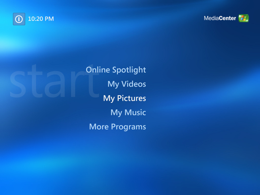
The background elements also call back to the design of Windows Media Center, which was included with the first PC my parents’ bought new for me.
iOS
Well, not exclusive to iOS, but certain elements of the site have a frosted glass touch to them. It’s subtle with the mostly-black background, but adds some nice flair.
“The 70’s”
Bold text, bold colors, simple designs. No references to the era specifically, just kinda lifting the general vibe.
Life
Orange is my favorite color. Wife’s favorite color bounces between sky blue and pastel pink. Our wedding colors were orange and pink. Nuff’ said.
What’s with the dice?
Needed a background element to go with the XPMCE thing. I was demoing this aesthetic on a custom startpage, and I figured it’d be fun to make it something randomized. At the same time, I wanted it to have a utilitarian purpose, so if I ever need a quick dice roll, I can just open a new tab! I’ve carried it over here, but might switch it in the future.
Going Forward
I want to spend more time doing things that bring me instrinsic happiness. Will writing in this blog be one of them? Who knows! But I’ll make an effort to keep up. Before I move onto the future, I’ll be transferring some content from my old site, doing some write-ups and reflections on my past few years of projects/life stuff, and having a bit of fun.